|
|
CALLIGRAPHY |
|
Writing has always accompanied man in the development of complex societies, from early history, it has always been essential for the cultural enrichment and development of great civilizations, during confrontations and encounters/clashes. The writings were evolving, were transformed, differentiated, similar to the languages; this evolutionary process still continue, and any writing, belonging to a particular historical period, always brings all the little customizations of those who helped to make it so until then. It is also noteworthy that the calligraphy: the beautiful writing, whatever it was, has never been popularized: it always remains aloof from the vulgar writings, serving to constitute esteemed writtens: artistic works in important and durable manuscripts. In the West today, the characters of the press is now generally imposed and there are few who actually write by hand, but many admire and appreciate the |
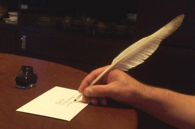
| writings in calligraphy: the beautiful writing is an art and should be used for important documents and everything you want to keep, which gives nobility, elegance, and distinction from what is common. Wedding cards, important invitations, business cards, thanksgiving and greeting cards, addresses on envelopes, written in calligraphy, become precious, unique and distinctive, and especially they will be stored with care in time. In the following examples, the handwritings, and especially the capital letters, are not artificial or modernized, but remain as faithful as possible to the historical writings, as well as writing tools. |
|
Miniature with a dedication in English Cursive Real size: 3.07 x 2.2 x 0.79 in; 7.8 x 5.6 x 2 cm. Body of writing: 0.118 in - 3 mm. Characters of the English Cursive |
|
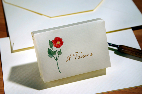
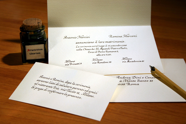
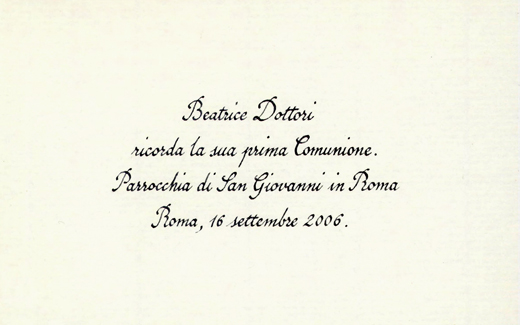
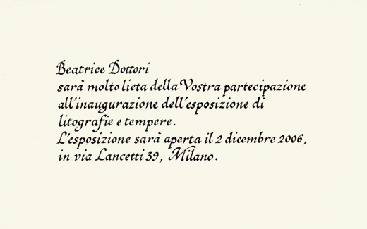
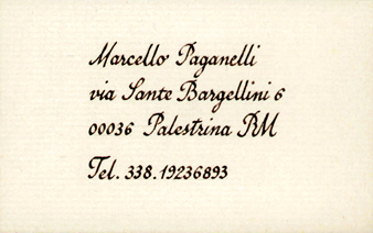
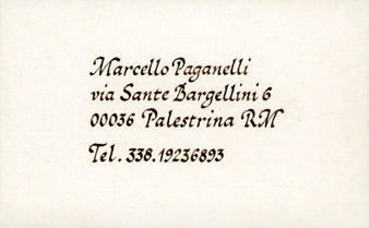
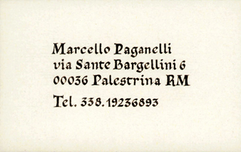
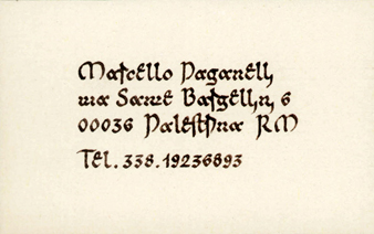
Wedding-card, invitation to the lunch and envelope with address. Italic Script / Chancery Cursive, made with calamus and medieval iron gall ink. |
|
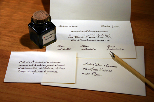
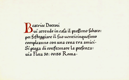
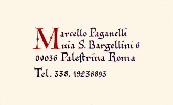
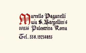
Wedding-card, invitation to the lunch and envelope with address. English Cursive, made with calamus and medieval iron gall ink. Characters of the English Cursive |
|
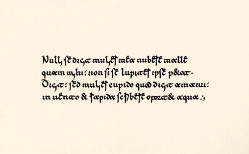
English Cursive It derives essentially from Cresciana Script, see “Il perfetto cancelleresco corsivo” by Giovanni Francesco Cresci, Rome, 1579. It was widespread in the Anglo-Saxon world, in epistolary, documentary, and commercial practices. Real size: 5.394 x 3.346 in - 13.7 x 8.5 cm. Body of writing: 0.079 in - 2 mm. Writing tool: calamus. Characters of the English Cursive |
|
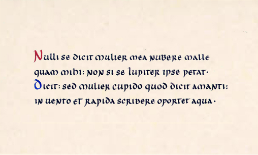
Italic Script / Chancery Cursive Used since the first half of the fifteenth century until today, as reproduced by the characters of the press; it was an invention of Niccolò Nicoli around 1420. Real size: 5.394 x 3.346 in - 13.7 x 8.5 cm. Body of writing: 0.079 in - 2 mm. Writing materials: quill pen, medieval iron gall ink. |
|
Note: the letter s used here, as in the following examples of Italic Script, Italian Gothic and Gothic Script, is in the present use:
until the eighteenth century, it taked this form only when it was the last letter of a word, otherwise it was like letter f without
horizontal dash (see next example of Gothic Minuscule). The V/v of the words “Vostra” and “via” indicate the phoneme
|
|
Gothic Minuscule / Proto-Gothic Script It was widely used in most of western Europe in the late eleventh century and the middle of the thirteenth century. Real size: 5.394 x 3.346 in - 13.7 x 8.5 cm. Body of writing: 0.079 in - 2 mm. Writing materials: quill pen, medieval iron gall ink. Note: the B capital is Lombardic, other capitals are Roman, the punctuation is medieval. |
|
English Cursive
It derives essentially from Cresciana Script, see “Il perfetto cancelleresco corsivo” by Giovanni Francesco Cresci, Rome, 1579. It was widespread in the Anglo-Saxon world. Credit card size: 3.346 x 2.106 in - 8.5 x 5.35 cm. Body of writing: 0.079 in - 2 mm. Writing tool: calamus. Characters of the English Cursive |
|
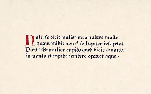
Italic Script / Chancery Cursive Used since the first half of the fifteenth century until today, as reproduced by the characters of the press; it was an invention of Niccolò Nicoli around 1420. Credit card size: 3.346 x 2.106 in - 8.5 x 5.35 cm. Body of writing: 0.079 in - 2 mm. Writing materials: quill pen, medieval iron gall ink. |
|
Gothic Minuscule / Proto-Gothic Script It was widely used in most of western Europe in the late eleventh century and the middle of the thirteenth century. Credit card size: 3.346 x 2.106 in - 8.5 x 5.35 cm. Body of writing: 0.079 in - 2 mm Writing materials: quill pen, medieval iron gall ink. Note: the capital letters are Lombardic. |
|
Italian Gothic / Gothic Rotunda Used by the twelfth century until the end of the eighteenth century. Credit card size: 3.346 x 2.106 in - 8.5 x 5.35 cm. Body of writing: 0.098 in - 2.5 mm. Writing tool: calamus. Note: the capital letters are Lombardic. |
|
GOTHICA·TEXTVRA·QVADRATA - Gothic Textura Quadrata Script It is the evolution of the Gothic Minuscule in a very sharp writing, it was in use until the beginning of the thirteenth century to the sixteenth century, particularly in northern Europe. Credit card size: 3.346 x 2.106 in - 8.5 x 5.35 cm. Body of writing: 0.118 in - 3 mm. Writing materials: quill pen, medieval iron gall ink. |
|
Beneventan Script, that is typical of Montecassino. It was used in central and southern Italy, in manuscripts of great value. See the next example of Beneventan Script. Credit card size: 3.346 x 2.106 in - 8.5 x 5.35 cm. Body of writing: 0.079 in - 2 mm. Writing tool: calamus. Note: in this example, the capital letters are uncial. |
|
LITTERA·VNCIALIS Uncial Script It appears with the rise of Christianity and parchment manuscripts, perhaps in opposition to earlier pagan writings. It is assumed that originates in North Africa in the second or third century. Body of writing: 0.098 in - 2.5 mm. Writing materials: quill pen, medieval iron gall ink. Note: The punctuation is medieval. |
|
Beneventan Script, that is typical of Montecassino. It was used in central and southern Italy, in manuscripts of great value, since the end of the eighth century until the thirteenth century. It is similar to typical Beneventan of Bari (Puglia), which is however larger, round and thin. Body of writing: 0.079 in - 2 mm. Writing materials: quill pen, medieval iron gall ink. Note: in this example, the capital letters are uncial, the punctuation is medieval. |
| Note: the Beneventan Script was based around the monastery of Montecassino (see also Cassino), several local variants developed and it spread also to Campania, Abruzzo, Puglia and Dalmatia, in fact Beneventan script (Littera Minuscula Beneventana) takes its name from the former Duchy of Benevento. The characteristic form of Beneventan script, that is better known today, is from the eleventh century, while Desiderius was abbot of Montecassino. |
|
Italian Gothic / Gothic Rotunda Used since the twelfth century until the end of the eighteenth century. Body of writing: 0.079 in - 2 mm. Writing materials: quill pen, medieval iron gall ink. Note: the capitals are Lombardic, the punctuation is medieval. |
|
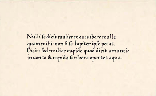
HVMANISTICA·ANTIQVA Humanistic Minuscule Script It is a Renaissance writing, combined with the Roman Capitals, with the advent of printing, it spreads throughout the Western world, it is currently the most widely and known writing. Body of writing: 0.079 in - 2 mm. Writing materials: quill pen, medieval iron gall ink. |
|
Note: in this example, the writing is faithful to those used in the
manuscripts and incunabula in the fifteenth century: the letter s
looks like f without the horizontal dash if it is not the last letter of a word,
the letter u shows indiscriminately the phonemes
|
| Epistolary, documentary and commercial cursive, typical of the fifteenth and sixteenth century. | Epistolary, documentary and commercial cursive, typical of the seventeenth, eighteenth and nineteenth century. |
|
|
Example of alphabet in English Cursive

Some minuscule characters can be formed in two ways: the letters “b”, “h” and “l”, can have the loop; the “r” and “s” can be separated from an eventual following letter or joined to it; the “w” and “z” can have two forms. |
|
Copyright © 2007 Nando Torelli |